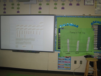
Students went on a pretend "field trip" and had to figure out how much food the cafeteria would need to prepare 18 lunches. Students had to decide if they wanted a sandwich, juice, or carrot sticks in their lunch. They could choose all 3 items, or just 1 or 2. We created 2 graphs using the data students collected: a picture graph on the smartboard, and a bar graph on chart paper. Students all decided the bar graph was the easiest to read because it made counting easier. What do you think?
 RSS Feed
